Pages

Showing posts with label dyeing. Show all posts

Sunday, October 28, 2012

Leftover Oatmeal

Before Sandy and her friend have a chance to knock out our power, I thought I would show you the results of the oatmeal adventure.

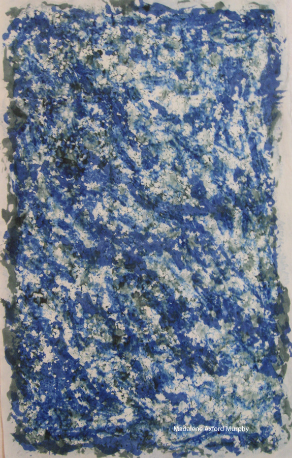
This had been covered with the boiled oats.  Part of what I am discovering with these experiments is how heavily to paint the dye on--and what painting tool to use. If you paint too heavily, the dye wicks under the resist and you end up with very little pattern; too lightly and you get too much undyed space with again no texture. The bottom three-quarters was done with a foam brush and I like what happened there better than the top when I used a small synthetic bristle brush. Lisa Kerpoe recommends a larger--perhaps a 2 inch--brush that I did not have (but now I do, ready for the next experiment!). Those places where the oats clumped together and raised off the fabric produced either undyed spaces or large blots of dye.  But even those spaces with very little texture might come in handy, depending on what I am doing.

Here is the result of the mixture of boiled oats in the middle and microwaved on the rest. And you can easily tell where I used the paint brush this time. But there is a further experiment in this piece: I used dyes thickened with sodium alginate for all of these because of the danger of plain dye bleeding under the resist, but I wanted to see if that would indeed be a problem since the dye paste solution in Lisa's book was fairly weak. So the purple dye has no thickener and you can see how it spread out under the oats but there is still some texture and I rather like the effect.


And here is the microwaved oatmeal. I am still not sure about the colors I chose.  The orange is a bit too orange for me. I have definitely decided that erring on the side of too much dye is preferable to too little--and I am not using that brush again!  The texture is somewhat different from the boiled oats but I am not sure I prefer one to the other yet.  And as for the low texture spaces, I can always do what I did last summer and add a second resist on top of the first:
This was done with microwaved oats but I also soaked the fabric in soda ash first and let it dry before I smeared on the oats.  In my most recent round I actually followed the directions and added soda ash to the dye paste. 

And if you managed to hang in there for all four explanations, thanks for the company!

Monday, November 7, 2011

And the lemonade

Amazingly, we have had two blissful days of relative quiet up here on our hill--not as quiet as it was two years ago but a distanced background noise--until this afternoon when the noise levels began to ramp up again. But I did manage to get a lot done during those two days--including rinsing out the contents of those dye buckets from my last post. I will share a few samples with you.

Several of my pieces were overdyes, attempts to rectify a dye job gone bad for some reason or simply another planned layer in a process. I had dyed several gradations of a burgundy a while ago that turned out looking unpleasantly like dried blood and so I added a layer of ultra violet and those pieces came out looking like this:

And I jazzed up a couple of lifeless browns with a little yellow:
I added a green background--the green didn't photograph very well so just imagine this a bit greener--to one of my flour paste crackles and suddenly those lines began to look a little like trees.
I couldn't resist doing another of my lined dyes and made this one vertical:
And I am playing around with these strange little squiggle shapes that I am finding intriguing:

And if you are still with me, thanks for the company!


Wednesday, August 31, 2011

It worked!

So nobody is home to share my excitement--except for Terra, who rarely gets excited about fabric unless it has had chicken juices or some such splashed on it. I just ironed a piece of fabric that finished batching this morning. A couple of days ago this piece of fabric came out of the dye bath with these great stripes of blue green on it along with regularly spaced irregular lines of dark blue green. I liked it, but I wanted to add something more so I folded it again and over-dyed it with golden yellow in the hopes that heavier lines of yellow would appear between the green lines.
It worked!

And, if you are home and reading this, thanks for the company!

Tuesday, August 30, 2011

A Beautiful Day to Dye

Since the trees here are just beginning to remind me that fall is coming, I thought I really should get around to that dyeing I have been thinking about all summer--before my dyeing studio, otherwise known as the basement, gets too cold for the dyes or me to work properly. And so for the past couple of days, I have been, like the trees, adding a bit of color to my world.


Sunday, July 31, 2011

QBL Part 2

There are so many things I want to say about my week at Quilting by the Lake that I have been trying to condense into one reasonably sized post, but today I just gave up and started writing. Jane Dunnewold walked into class Monday morning and we were soon moving from the familiar territory of the basics of dyeing and fabric manipulation to dyeing silk and rayon and making stencils.  By the evening of the first day the common room of our dorm suite--all three of us in the suite were taking the same class--was covered with color, all small samples drying for the next step the next morning:
My fabric is on the coffee table in the upper left of this picture. Most of these fabrics went through an another overdye bath and some even a second overdyeing, and soon some of them were becoming backgrounds for the stamps, stencils, and paint.

"Now is the time to experiment with a color you don't like," Jane said at one point, and so I tried orange with my sun stencil, a color I shy away from using.
This is a piece of silk, although the photo does not pick up the luster. I fell in love with silk during this class, the way it takes dye, the way it moves, the way it shimmers, the way it feels.

Another piece of silk became a beautiful mottled purple after three dyeings, and then took two layers of stenciling, the second layer with a metallic paint. 
One of the assignments was to choose a background with a gridlike pattern and add shape/color to it:
This is a rayon fabric, and I began with adding the colored rectangles and later in the week when we learned how to apply gold leaf, I added that. I think I am ready to add some stitching and see how the gold leaf responds.

We also made stamps and then played with creating a repetitive background pattern.
While we were learning all these techniques, we were also getting a hands-on course in color theory since we had to mix paints to create analogous or complementary colors, according to the assignment.  And I finally understood how a color wheel really comes in handy.  

Another new technique I got to try out was screen printing, and probably due to beginner's luck, I really like the piece. We covered our screens with flour paste, let it dry, and then scratched something into the dried paste. For some reason, I was thinking of all the beautiful tall grass in the fields I walk through with Terra each morning and so drew four grass stems. Jane suggested I print several of the same image on the same sample fabric, just moving the screen a bit each time, and adding another color after a couple of prints. This is the original background that I manipulated and overdyed one more time to get the soft grid behind the grass:
And here is the printed piece:
It was calling for something more--a round moon that I originally thought would be gold leaf, but I waited until I got home to decide and ultimately added two layers of tulle so that you can still see the grass through it.
I am not sure what I will do with this sample yet, but it's good enough to take to another stage.

So here's a picture of Jane "wrapping up" the class, after a very stimulating, busy, exhausting, hot week. (Thank goodness for air conditioning as we broke 100 degrees one day!)
I'll save the analysis for the next post. And if you're still reading, thanks for the company!


Wednesday, July 27, 2011

Composted fabric

So my little packets of compost bin fabric had been air curing in our barn while I was away and I couldn't wait to take a peek at them. It had been the requisite couple of weeks and there they were, looking rather......mummified:
The next step was supposed to be discarding the grass they had originally been wrapped around and hanging them out on a clothesline to cure a couple more days--no mention of what to do when they were desiccated and board-like. 

So I soaked them in cold water for a bit and began to carefully pull them apart. And now I know what you get when you put fabric in a compost bin--composted fabric.
Perhaps our compost bin is just a bit too enthusiastic, but the fabric had begun to digest just like the vegetable peelings and weeds that had surrounded it. Cotton does, after all, come from a plant and should react the same way. 
One site that I had consulted online had said that bug damage could be a problem, but she optimistically went on to say that a couple of holes would be acceptable for the kind of quilts she makes. This is way beyond a couple of holes. No pictures, by the way, of how her experiment turned out. As a matter of fact, I realize now that there was a curious absence of pictures of the finished products.

Anyway, the fabric fell apart in my hands, just as if it had been in a tomb for a couple of centuries. But when I looked closely at some of the bigger bits, there were some intriguing patterns of a rich brown color that made me wish this had turned out better.
Hmmm. Perhaps if I let it compost only a week, instead of a month. . . .

Oh, and if you are still reading, thanks for the company!

Tuesday, July 12, 2011

Warning! Yucky Pictures Ahead

As I continue to tumble through this busy summer, quilting and blogging seem to have taken a back seat to visiting kids and grandkids, cleaning for overnight guests, and helping a fledgling growers' market take root, but I have not forgotten the grand experiment. I began to worry a bit about it since the weather has been quite warm and the compost, I was sure, was cooking away. It was actually a bit hard to identify the two packets of fabric and grass among all the rotting veggies, but after mucking about a bit, I was able to get a picture so you can share the entire process with me.

It did look like one corner of one of the packets had started to decompose so it was definitely time to move on to the next stage--letting the bundles cure for a couple of weeks. But since this whole experiment is more serendipity than planned, I had not thought about where this curing would take place. In case you didn't get the full glory of their rottiness, here is a picture of them lying on the ground.

I thought about just leaving them there, but we live in a rural area with raccoons, foxes, and even the occasional bear wandering through, any of which might pick up a strange bundle, not to speak of what Terra, our domestic lover of rotty things, might decide to do with them.

Strangely enough, they do not smell much--a good mix of ingredients in the compost should not smell as it cooks and I guess we were lucky this time, but there is enough of an aura about them that I did not want them in the basement. The barn seemed possible and Tom, who has been my intrepid helper, found some old open weave plant trays to put over them, held down by a heavy bucket. They should get enough air circulation to get the curing process going and yet won't be easily carried off by some curious critter.

So we are back in the waiting period again for a couple of weeks. And if you are still with me, even after those pictures--the next should not be quite so disgusting--thanks for the company!

Sunday, June 26, 2011

Ew, Yuck!

A couple of months ago, I received in the mail an article from Betsy, a friend of mine, about compost dyeing. Said she was reminded of me when she saw it. (I'm hoping it was the dyeing part and not the compost that reminded her of me.) Although my first thought was that this was a thoroughly disgusting idea, I couldn't help wondering what kind of fabric it would produce. So one day I decided that all I would risk was a yard of fabric and why not give it a try.

The article said to wrap grass clippings and some other vegetation in the fabric, roll it up into a packet, and then bury it in the compost.  I of course had to take a picture so you could share the experience with me:
And here it is decently buried in the most recent additions:
I am a bit skeptical about how much of the color the fabric absorbs will permanently stay because the article said nothing about treating the fabric with anything or adding a mordant and usually vegetable dyes need something more to make them stick. But the fabric packets are supposed to cook for a month or two and then air cure for several days so we shall see.  It has now been decomposing for over a week.

And if you are still with me after that stomach-turning picture, thanks for the company.

Thursday, December 16, 2010

Pushing the Limits

When I began dyeing, one of the few rules that I heard from many sources was that dyes needed warmth to work and therefore the room temperature should be at least 70 degrees.  My dyeing "studio" is in the unheated basement, where, even on the warmest day in summer, the temperature rarely reaches above 68, so I have already been fudging on that requirement a bit.  But normally as the weather turns toward winter I reluctantly curtail my dyeing activities and focus on turning that fabric into quilts.

Last winter, however, I discovered snow dyeing, which involves pouring dye solution over snow-covered fabric, which I am fairly sure is nowhere near 70 degrees.    And so late in November this year, with a few free hours, I decided to see how hard and fast that temperature rule for regular low-immersion dyeing was.  The temperature in the basement was below 60 while I was working and was around 50 by the time the fabric was finished batching.

To complicate matters further, I decided to play with some overdyeing and folding so here are some of the more interesting results:

These were two old dyes: first a dark brown poured over a diagonally folded piece of fabric and then with fabric folded on the other diagonal. a deep yellow.  The  dark brown turned a little purple but was still an interesting color and the yellow seemed strong even with the colder temperatures.
I loved this piece.  It was the last minute attempt to use up an end of fabric that I had cut off one of the larger pieces and to use up that dark brown dye, this time used with a greater concentration than the yellow piece.  I simple folded the piece quickly, dumped some dye on it and let it sit--and got lots of little texture bits along with the stripes.
Then I tried some shibori.  When I had done shibori before I had chosen a wide diameter piece of PVC pipe, carefully wrapped one layer of fabric around it and sewed it together so that it fit tightly around the pipe, and then scrunched it, but I had read about just folding the fabric, wrapping it around a pipe as many times as it would go and then scrunching.   My wide diameter PVC pipe had disappeared with some plumbers who were working in the basement a few months before and I only had a smaller pipe so I wrapped and scrunched, then poured dye around it.  And this was the magical result.  This was old dye, however, so I decided I had to try this with some newly mixed dye concentrate.  And here is the result of that:
The final analysis:  first of all, there were too many variables for this to be truly a scientific experiment, but nevertheless, working in cooler temperatures produces usable, interesting fabric so my dyeing season is definitely longer than it was.  I am hoping to have some time to dye this week after the nighttime temps have been in the teens and single digits for a number of days and the basement is even colder.  Then again the dyes may work when it is that chilly, but I and my fingers may not.  

And if you are still with me, thanks for the company.


Friday, August 20, 2010

Oh, Shoot!

That's what I would often say--or something less printable-- when I was trying to photograph one of my quilts to send to an exhibit somewhere.  Since exhibiting my quilts has not been a major priority in this year of experimentation, I have not had to confront my ineptness in this area--or bring up my usual complaint:  why should a quilt be judged on the basis of  a quilter's skill in photography or her ability to hire a professional photographer?  Not only is professional photography expensive, but here in rural northcentral Pennsylvania there are no local photographers who have experience photographing quilts.

Nevertheless after getting several e-mailed calls for entry for a show I had gotten into a few years ago, I began to get the urge to attempt the process again.  But one of the quilts I wanted to enter I had tried to photograph before, had even had a friend photograph it who has won so many awards for her photos that she might as well be called a professional, and neither of us, either with indoor lighting or outdoor, could get the color true on the photos without a color adjustment in Photoshop Elements.  And the rules, as they so often do, clearly state:  "Images cannot be enhanced in any way, including color correction."  I have a penchant for purple, you see, and it seems that purple is very hard to photograph; it turns blue or gray.
Okay, I said, this is my year of learning.  Let me confront my ignorance and see if I can learn something.  I had known about Holly Knott's website for a while and her tutorial "Shoot That Quilt!" that steps you through the process of photographing a quilt.  So I actually sat down last weekend and read it, bought some of the lighting hardware at our local Dunham's Do-It Center (I tried Walmart but I'm glad to say the reflector lamps were too cheap and wouldn't hold steady on the posts), ordered the bulbs she recommends online and made do with 150 watt regular bulbs for this session since of course the deadline was today.  Took about an hour total of my time putting everything together.  Well, part of that hour included Tom's time since he has a new drill he wanted to use to put the screws in.  And I now have better and more reliable lighting than I have ever had before.  Two of these less than elegant gizmos can light a quilt quite nicely.
Along with a talk at our guild meeting at the beginning of the week that just happened to be by local photographer Caleb Williams, she gave me confidence to play with the white balance on my camera.  I learned another technical term--bracketing (taking an underexposed, normally exposed, and overexposed set of three pictures) and tried that, feeling proud of myself that I had figured out one more thing about my camera.  I couldn't tell from the camera screen how correct the color was so  it was quite a surprise when I downloaded the photos to my computer and there was my quilt looking reasonably like it should, without any color correction needed.
The next hurdle was the 5 x 7 inch format required.  I might have been able to squeeze this into a 7 x 5 but had no idea how to fit this vertical image into a horizontal space.  In Gloria Hansen's book, Digital Essentials, which has become one of those what-did-I-do-before-I-found-this books in my library, I discovered the specific steps I needed to resize the image. 

So I made the deadline for the entries. Even though the photos are a bit better, that's little guarantee that the quilts will be accepted.  The one above, which is called No. 61,  is one of my favorites because it captures so many meanings for me.  I created all the fabrics for this piece--the background is painted with Setacolor and sun faded, and I dyed the deep purple and red to fit the project.   I love the contrast of texture and color and movement.  But it's small, only about 36 x 26 inches, and  it is certainly not as flashy as so many of the quilts are these days.  We shall see what happens.  And if you're still with me, thanks for the company!

Monday, August 16, 2010

New Week's Resolution

I have woefully neglected this blog in the past few weeks, but it is Monday, the beginning of a new week and I have resolved to be pay more attention to journaling my quilting journey.  Since this blog focuses--or tries to--on quilting/art related topics, I will not tell you about one of the big distractions from my quilting last week:  an energy-filled visit from our 2 1/2 year old granddaughter and her parents, which of course involved preparing a house full of pointed quilting tools as well as dust in corners I normally don't notice.
Even this was quilt-related, however, since I was forced to take some time out to organize fabric and rulers, and I also had a great talk about the meaningfulness/usefulness of art with her mother. 

I also taught two classes, the first on making labels using a computer printer and the second on dyeing.  Great people signed up for them so there were lots of questions and a good bit of laughter.  And I thoroughly enjoyed both.  The dyeing class was somewhat dependent on the weather, since it was to be outside, but that Saturday morning dawned beautifully sunny and refreshingly cool--a bit too cool for the dyes, but I managed to get things warmed enough that they seemed to work fine.   I often get too involved in the classes to remember to take pictures, but I did record the final exciting moment of truth when the iron reveals exactly what the fabric will look like.


And I have been quilting, just not writing about it.  Our local guild's biennial exhibit opens Labor Day weekend and I have been hard at work trying to finish two quilts.  I realistically abandoned a third that was just not going to get finished by the deadline.  And I am on to the binding at last on one:
 
Binding should be easy, right?  But even here this quilt gave me a challenge.  I had decided not to face it because I had triangles going right to the edge and I felt they needed something beyond to finish. 

I finally decided that binding it in the dark gray would finish the edge but not call attention to the binding.  I had dyed almost all the fabrics for this quilt and had found that gray was much more challenging than I thought.  It was very easy to get a gray with an obvious green or blue cast and this was not what I wanted.  Finally I got the perfect color for the body of the quilt but then decided the best color for the border would be gray.  Not enough dye left, of course, so I had to put a quick order in to Dharma and then kept my fingers crossed that the mix of dyes would work again.  It did and I thought I had used most of that fabric up creating the border.  But now there was some perfectly good dark gray that I could use as a narrow binding--or so I thought.

I set about squaring up the quilt and measuring the binding strips and sewed the first side on.  Luckily I decided to check things out before starting the next side.  My binding, which had looked fine in regular light, had a slight but definite greenish cast in bright, clear lights when it was attached to a whole side.   Not acceptable.  You'll have to take my word for this because I could not get the contrast to show on a computer monitor.   Not only that, I had stopped the quilting about a half inch below the binding, thinking it would be a nice contrast but it looked unfinished.  More free motion quilting was called for! And that meant more squaring and measuring. . . .

After a day of depression and questioning whether this ornery quilt was worth it, I sat down to add the quilting and a wonderful thing happened.  I found myself having a good time.  I am still not satisfied with having complete control over my stitching--no Diane Gaudynski in this house!--but I have done enough of it with all those Doodle Squares that I can get in the flow of it and have fun.  I knew that free motion quilting was not as stressful as it once was, but I would never have thought that I would look forward to that part of the quilting process.  

Black seemed to be the best choice for the binding and, as sometimes happens, it was good that the gray did not work out because the black provides a better frame for all the movement in the quilt.  Of course there is still the hanging sleeve and the label as well as a bit of hand quilting to do yet, all of which take more time than they look like they should.  But this quilt looks like it might make it for the show.

My second quilt is very experimental and difficult to photograph.  I am still not sure whether my planned hanging system for it will work, but more about that later. . .  And if you're still with me, thanks for the company.

Wednesday, August 4, 2010

Experiments

Last week I escaped the heat by retreating to the basement to do some dyeing.  I did some gradations--tried a new yellow that produced a rich, lovely gold that I will definitely use again, dyed some purple because I can never have enough purple and then I decided to play.  I tried some folding, tighter and more regular folding than I had done before and here are a couple of the results:

I don't really have anything to say here, although you can see that beautiful yellow in the above piece.  I just thought these two needed something to separate them.  
The next day I finally got around to trying out a flour resist.  Remember that flour paste you might have made as a child?  Well, this is very similar, except you smear it all over a piece of fabric, let it dry and crack, and then put dye on top of it.   Here is the result.  It is not the prettiest fabric I have ever dyed, but I am intrigued by the patterns created by the cracking and will definitely try it again to see if I can work up to something I have a little better control over.  I might even find a full description of the process somewhere, since I was making some of this up as I went along.
You can click on the image to get some more detail.  Part of the learning experience was realizing that leaving the flour resist in the basement over night while it was drying was not a good idea.  A very small critter--probably a field mouse--paid a visit and left tiny footprints in the flour goo and sampled it in several spots, memorialized by the bigger splotches of dye on the fabric.

While I was waiting for the resist to dry, I searched out my Setacolors, painted a half yard of fabric, put it out in the sun, and swirled it to see what would happen.  I brought it in after about an hour, ironed it to heat set it, and, as usual, magical things had happened.  It is definitely a favorite!

Now back to those quilts I must have finished by the end of August.  And if you are still reading, thanks for the company!

Monday, February 15, 2010

Snow Dyeing--New Technique

Some snow dyers had been mentioning online that they don't let the fabric sit in the dye as the snow melts but raise it up off the bottom of the dye bin.  And they seem to get different results from what I was getting so I couldn't wait until the next snow to give it a try.  I scraped up some snow from the piles that had slid off our barn roof and that snow did pack a bit better than the dry flaky snow I had used last time.  And wow! the results were different:
 This was mostly navy blue with a bit of some old mist gray.  Click on the image for a closer view.
This is probably my favorite piece so far and I thought it was going to look like something the dog threw up when I was adding the dye.  I began with some old brown but realized when I emptied the bottle that, even  though I had shaken it well, it had not thoroughly mixed.  So I thought I would possibly save it with the kilt green I had just mixed for the last batch, but I ran out of that before the snow had been sufficiently covered with dye.  This was supposed to be an experiment so I didn't want to spend any more time mixing a new batch of dye.  After rummaging about I found a very old lemon yellow and when I squirted that on, it did not look very appealing.
Here are details of each so you might be able to see the crystalline petal patterns better:


For those interested in the technique I used, here are some more pictures:

I used 1/2" hardware cloth cut so that it did not fit all the way to the bottom of the sloping sides of the bin and supported in the middle so that it didn't sag.  

The fabric in this one is in an old narrow dish drainer--never throw anything out!-- with the snow mounded on top and you can see the side view below.
Even though it looks like the dye may not reach those side pieces, there were not white spots in the final fabric.

These were results significantly different from what I can get with my regular low immersion dyeing in the summertime.  Now for a project worthy of their uniqueness. . . .